Advertorial Dissection and build something new
What was the expectation
The customer wanted a Advertorial page that users could simply connect with. The item was a latte, which already had a customer base. But the outdated Advertorial proved ineffective.
My contributions
- Research on product
- Product placement and hierarchy
- Responsive design
- Prototype
Let’s see how the old design looks -
As you can see, this needed a lot of care and was really premature.As you can see this was very premature and needed lots of attention! I decided to take a chance in order to connect with the audience and make this advertorial successful. Although it was never simple, I was somewhat committed.
Get set Go
I put some notes on every sections. Tried to make some valid points. Every sections needed to work from a perspective of product focused.
Extract Colors and Shades
Found inconsistency on the colors. So I decided to fix that first.
Hero section
Product Placement
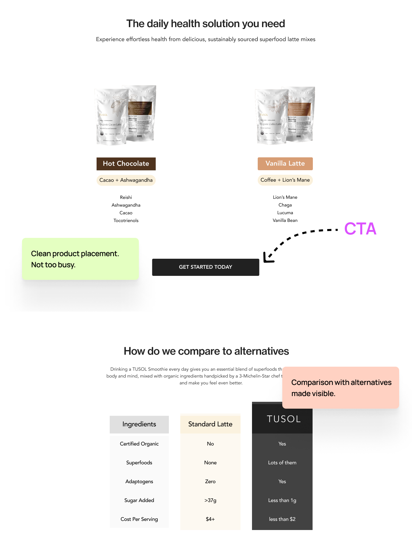
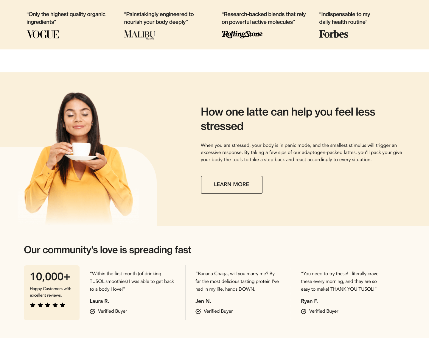
Review
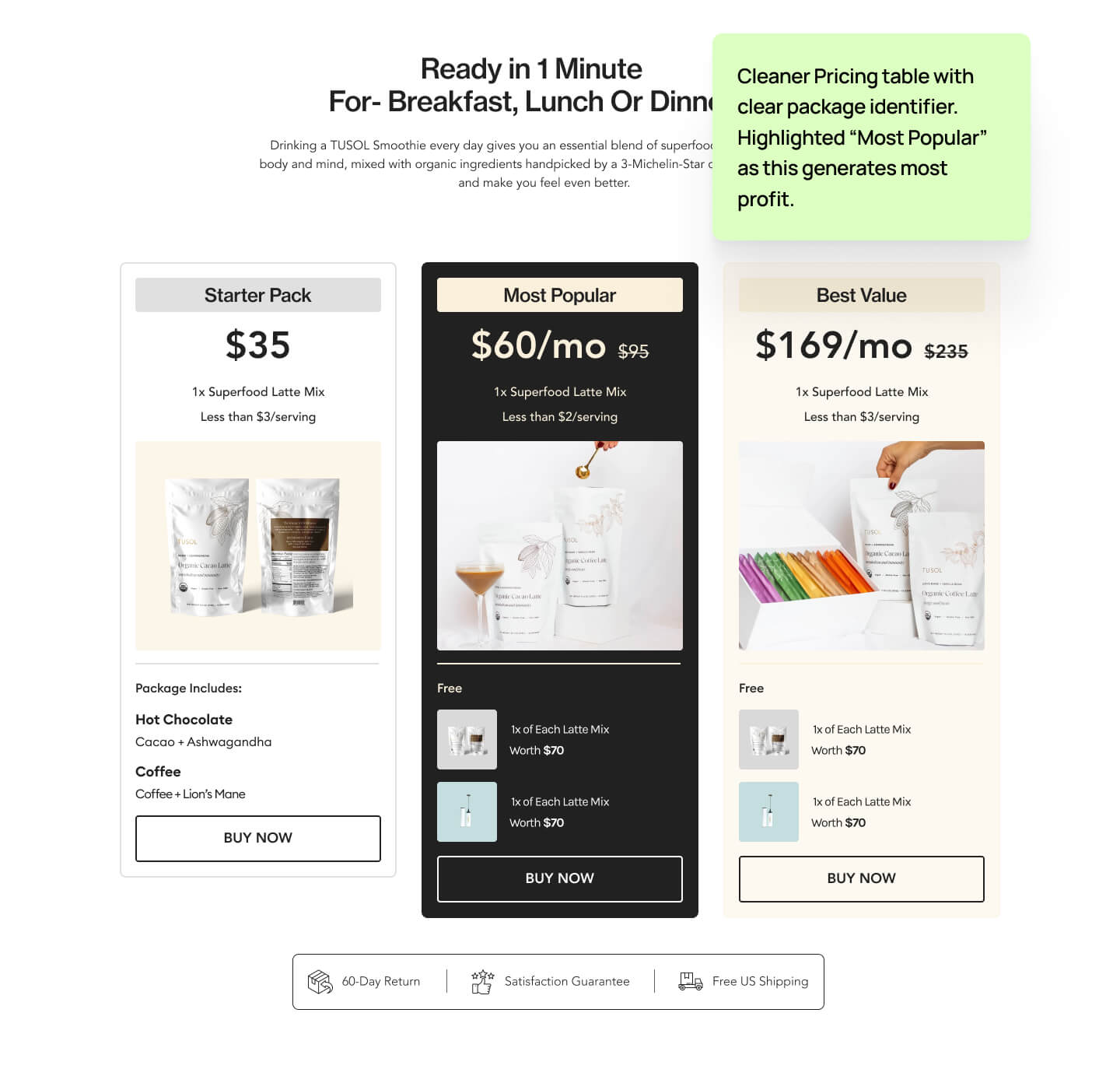
Pricing
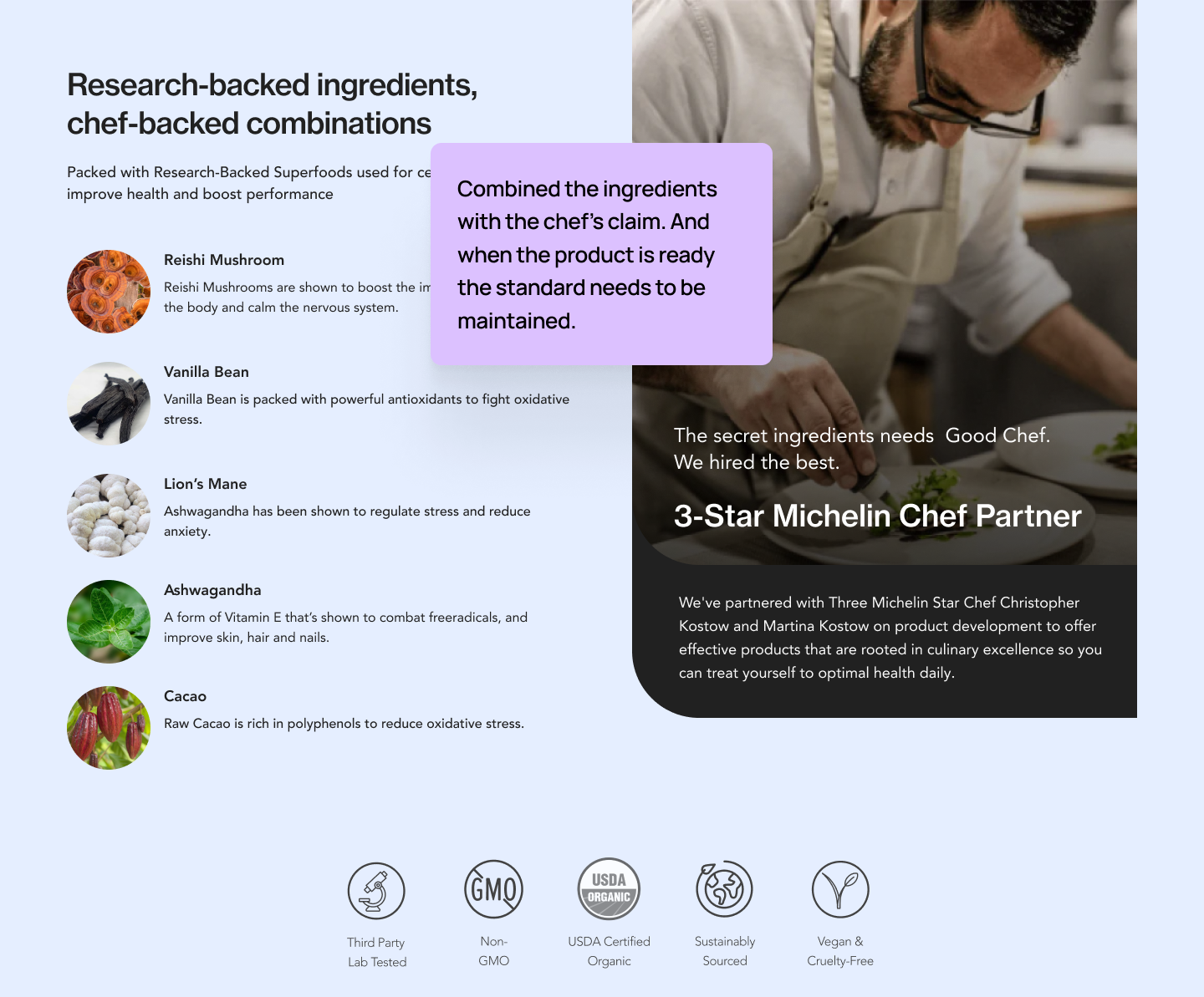
Ingredients & Chefs
Key Improvements
- Clean hero section with less confusing CTA
- Main product placement with cleaner look
- Product comparison with simple yet strong visual.
- Balanced user review section
- Business friendly pricing plan design.
- Merged scattered sections into one section which still provides the same message with a different compact story.