
Unet Redesign
App Overview
Unet is a banking app Provided by united commercial Bank. The sole purpose of the app is app is to avoid the branch queue and use the power of convenience to manage banking needs from the comfort of home. User can also perform some day to day task like Mobile recharge o/ MFS platform transfer like Bkash-Nagad / Pay utility bills.
Why think of Redesign?
As I have account on United Commercial Bank and I am a day to day user of the Unet App I felt discomfort using this app. At first I thought may be I’m having the problem since this is the first banking app I was exploring back then but I noticed some of my collegues were having the same problem. Everyone remain silent because the app was serving the purpose and adpoted the app already.
Why think of Redesign?
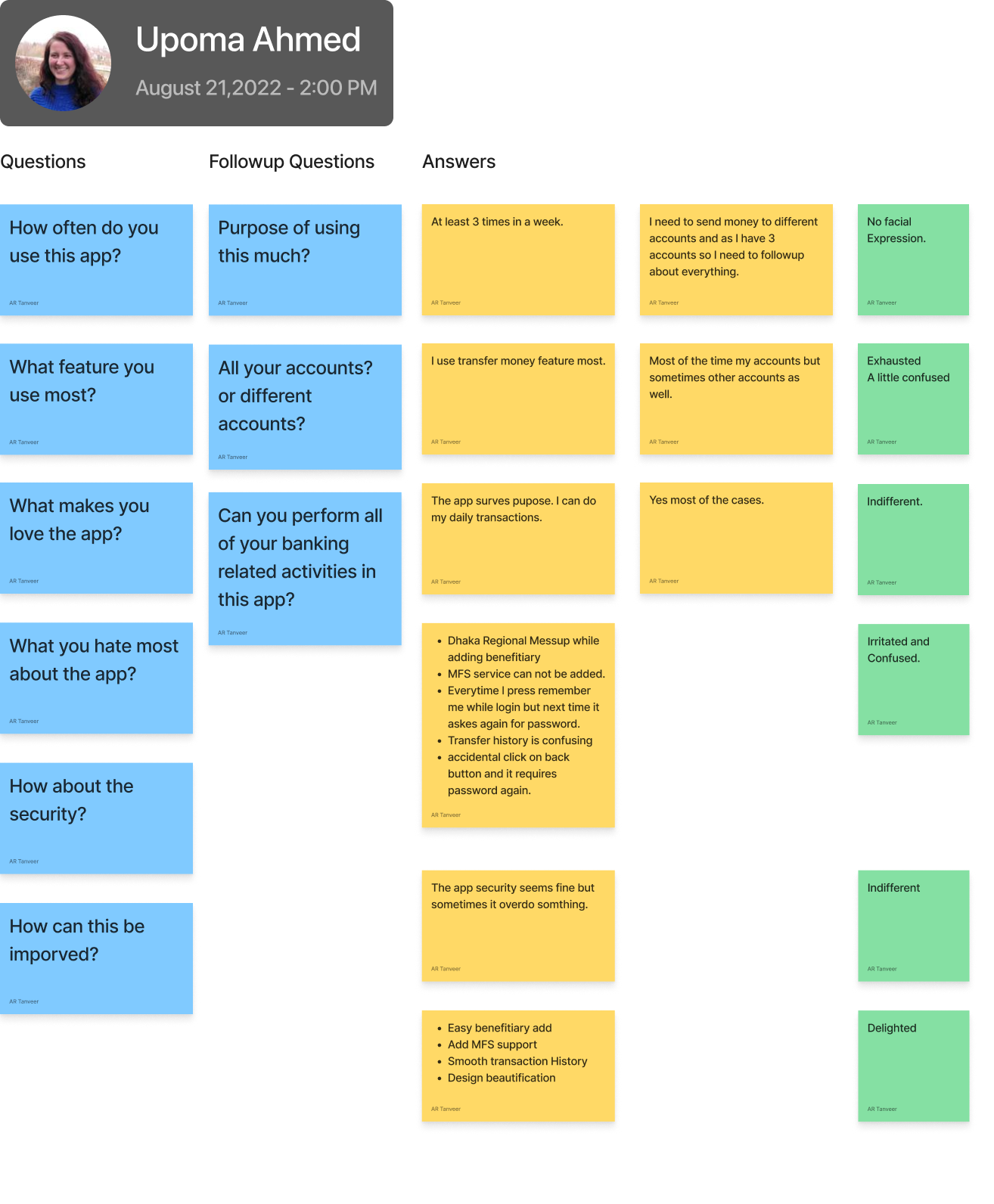
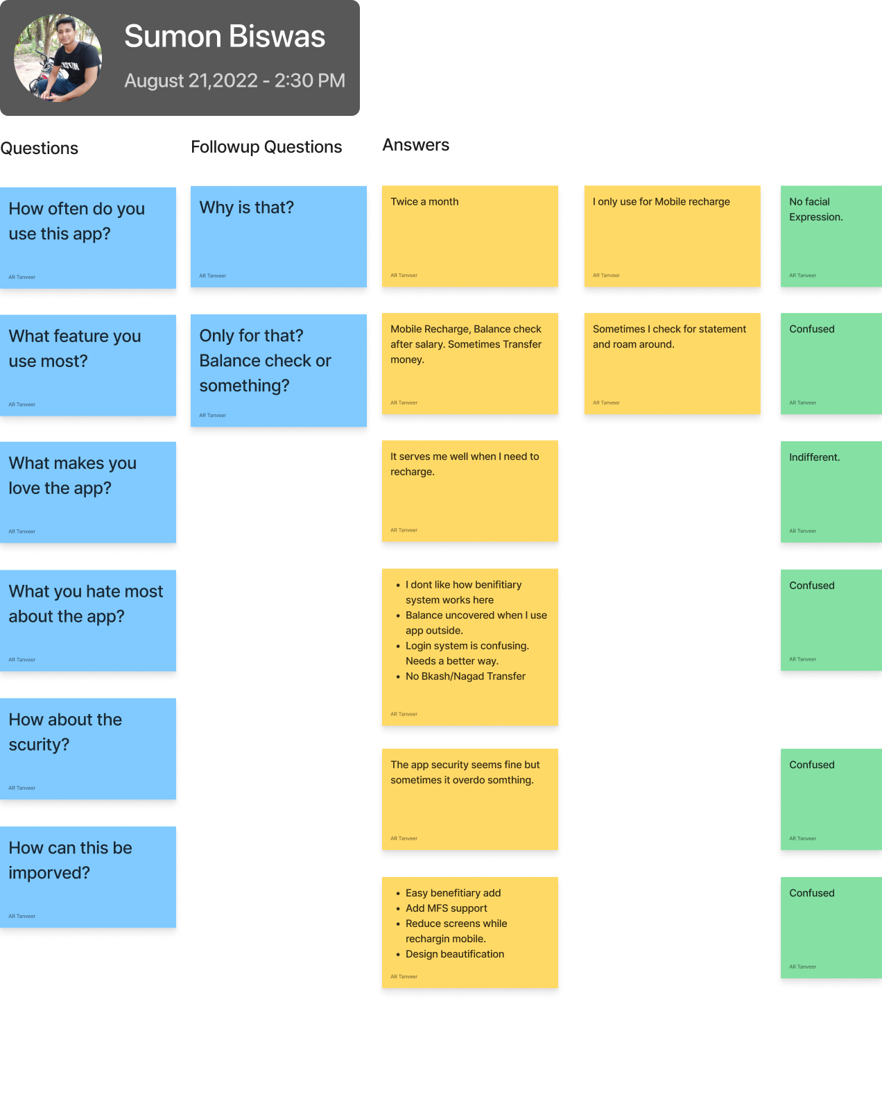
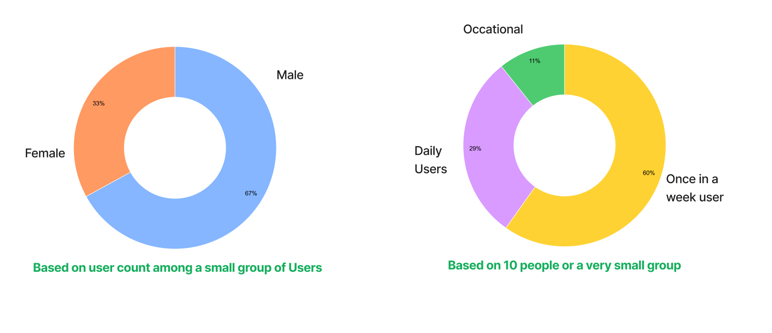
Conducting Interview was easy for me. I just took schedule from 5 of my co-workers who were already existing users for the app. Two of them were female and 3 were male.
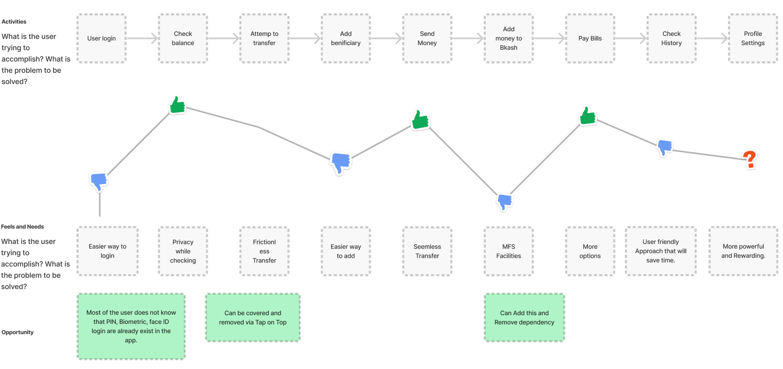
Got some interesting Insights while doing the Interview. See below for the detaild Interview session-
I asked to use photograph but as this is going public my female co-worker requested not to use her picture. So I’m placing a dummy instead.
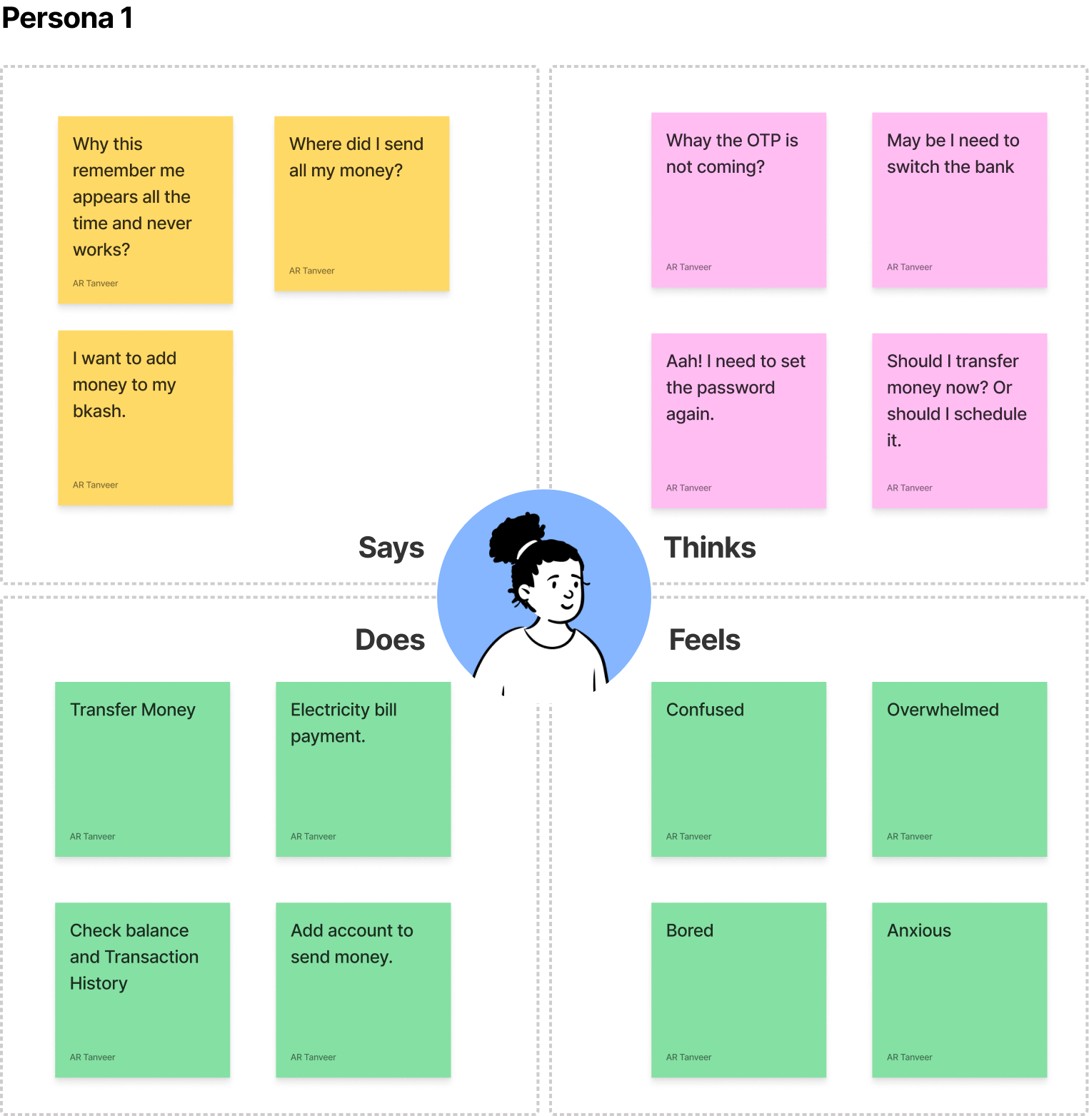
Based on user Interview I managed to create Empathy map for two user group

From user interview and Empathy map now the problems came out bold. Here are some listed problems that I found out. Added some problems as well from my perspective
Problem Statement
- When the app launch it shows the Action menu insted of login.
- Checking balance is easy but for multiple accounts it is so tiny dropdown.
- The app is confusing and sometimes user feels overwhelmed.
- Beneficiary management is not good. For repeating transfers to same account the benificiary management is not giving a very pleasent experience.
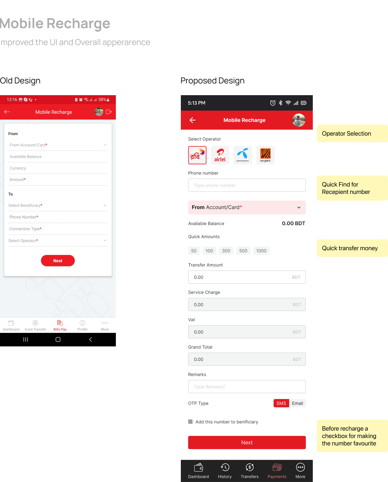
- Mobile recharge and MFS Transfers are frequent need. It takes a good amount of time to perform these tasks.
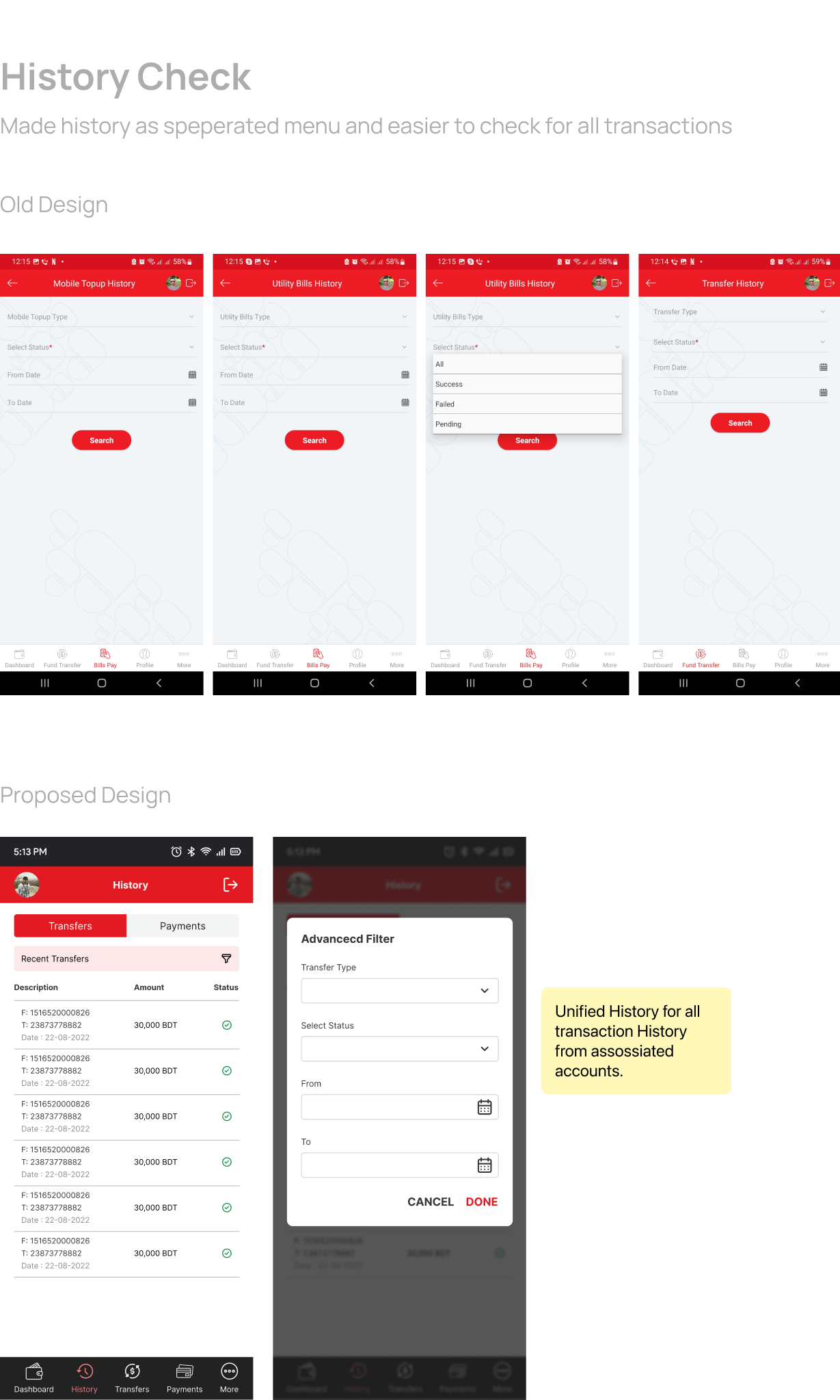
- Transaction History is hard to find and It is decentralized even after they are connected with the same account.
- Old UI elements make users laggy while they perform task.
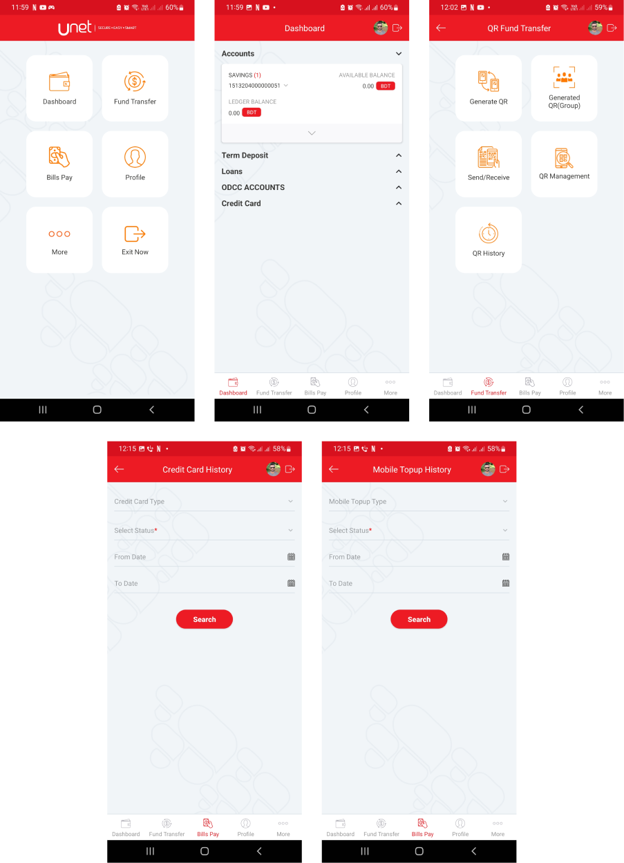
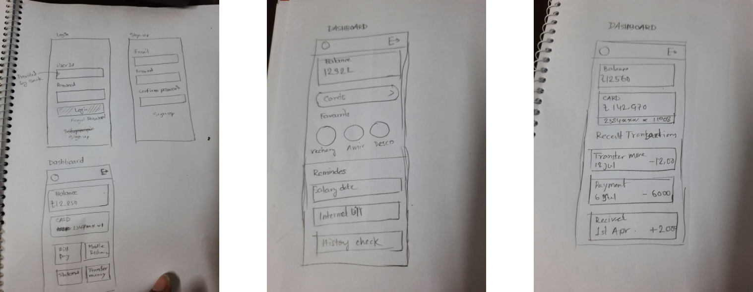
Some old screens for better understanding -
User journey Map
From the problem statement I tried to create a user journey which is far from complete but I had an overall idea-
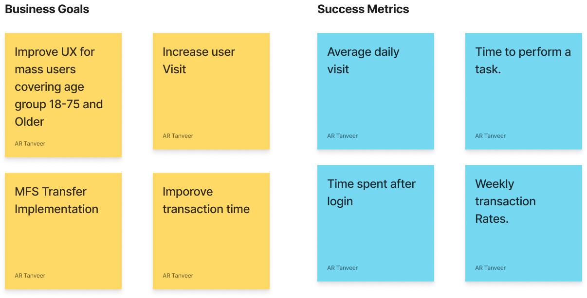
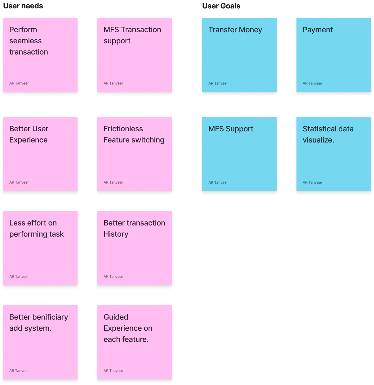
The problem statement is ready with the journey map but there is still something I needed to take care. While exploring the problem I found out some spieces that can really boost the the business as well. I mean this is not the best app in the market but some important changes on the app can count this at least as a competior. So visualize the problem and tried to align the needs and Business value in the same ground.
Frame the problem
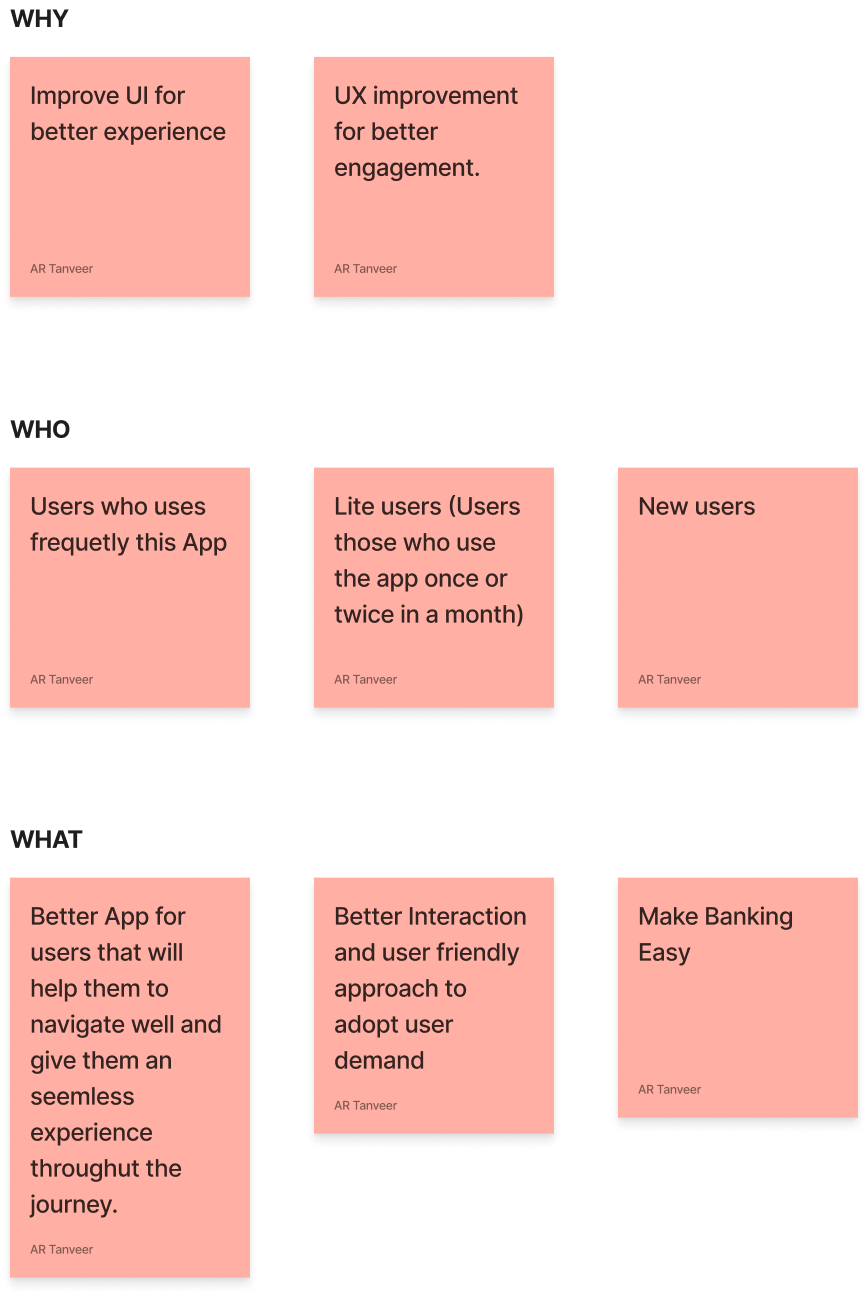
Understand the business
Understand the user
Pen paper sketches
As this is a banking app most of the screens contains form elements which is necessary for banking, transfer purpose. Changing those screens and making the fields rearrange may result to hamper the soul purpose of a banking app. I decided to only focus on dashboard as users will be redirected to any kind of banking affairs with this screen.
NB: For banking app some banks provide username to respective email address some don’t. For security purpose Unique user Id from bank makes the app more secure in many ways.
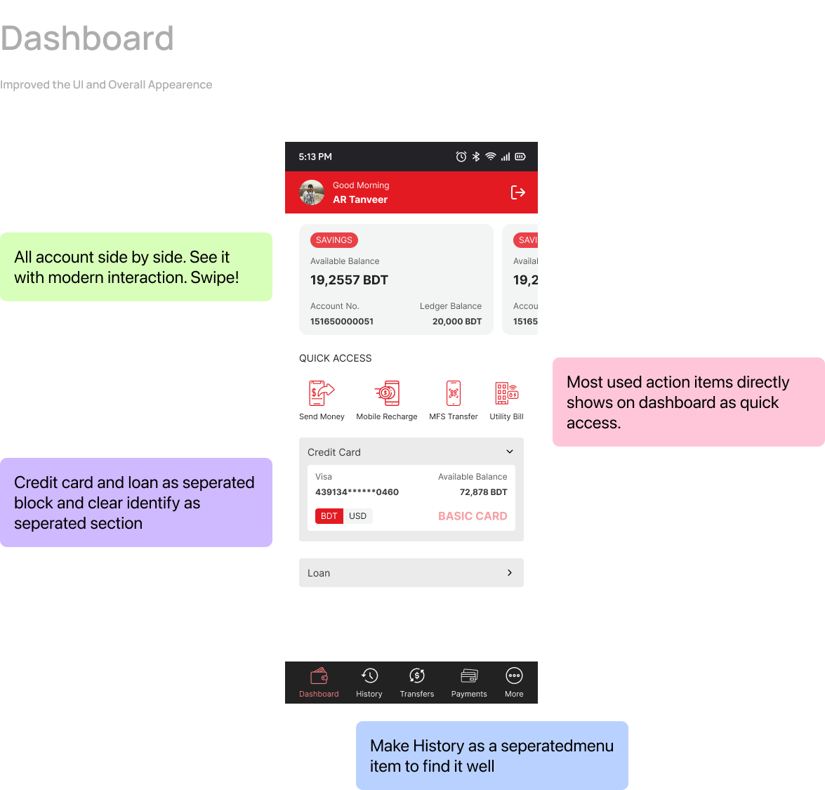
Hi Fidelity Version
I already had something in my mind. So I decided to go for Hi-Fi version. I changed the flow a bit and made some imporvements on Dashboard. Lets see how I did that-
As I created some of the screens already and confident enough to test those for real users I created a Usability Test Plan. The Plan contains Goals, Feature Test, User Demography and Task lists to perform. Here is the whole process-
About the test
Unet banking app is widely used among the UCBL Customers. The current app has some issues that is directly affecting the user experience. I am trying to resolve some of the existing issues and this test needs to be performed among the existing users. The test goal is to find out if the new design really helping users to perfom usual tasks better and do they find eveything easily.
Features to test
- Balance check
- Transfer Money
- Recharge mobile
- Add money to MFS (Bkash/Nagad)
- Access Profile
User Demography
Goals
- Reduce stress of navigation
- Frictionless Money Transfer
- Easy Transaction History
- Reduce time for performing tasks
To be continued…