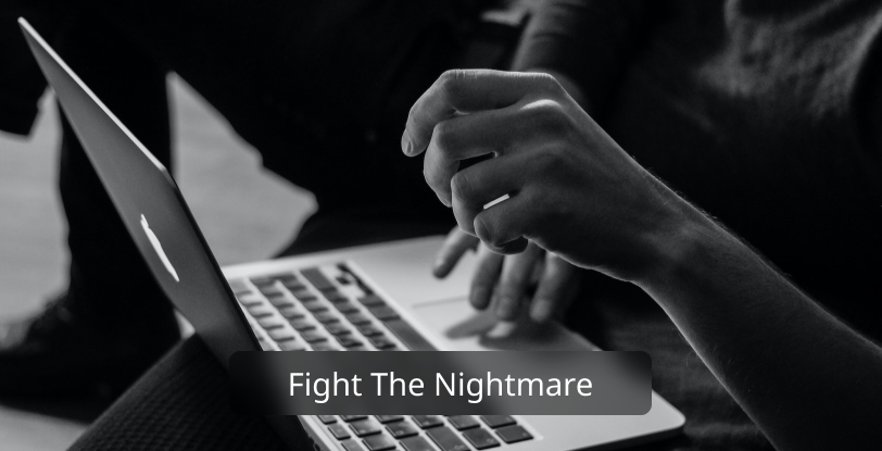
Designing a homepage: Haunting a nightmare.
It is a UI designer’s nightmare to have to demonstrate to stakeholders who have less knowledge. Colors and layout are usually hard to argue with. The more difficult it is for a UI designer to stand out if he/she lacks the solid knowledge of defending their choices.This is story of designing a homepage for a top tier club
About Tiger’s Den(Gulshan Club)
The Gulshan Club is one of the top clubs in Bangladesh. It is currently the only family club in the country. In this club, the country’s high-profile people come together through arts, sports, and various events and initiatives.
Step into the Unknown!
I was so motivated that I went for the first requirements. So I acted stupid and wrote down what they really wanted. Thanks to the recorder, it was a scattered one. As I recorded, I took notes. And guess what, it exceeded three pages. It came down to a few points when I made bullet points. Lough out Loud. Here are the bullet points-
- Classic style homepage
- Two different font needs to be introduced
- A Good background color needs to be suggested. They preferred white and showed their affection for white backgrounds. and make the titles Golden color as their brand color is close to golden.
- The site needs to be responsive and for desktop, it should fill the full viewport. (The examples were shown on a laptop!)
- A glimpse of the whole website should be on the homepage. (Phew!)
I tried to argue about some of the points but after some time I decided not to because that would be waste of time. And I believe visuals are stronger than verbals.
Gladiator with shield
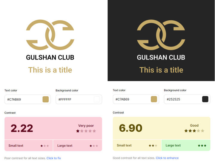
Color contrast
The logo color code of Gulshan club is #C7AB69 which has a contrast issue with white background. To ensure that the color I chose works well, I had to create a comparison. On a white background, the logo looks fine, but the title colors appear a bit off.
Font Face
There are two fonts I have proposed. One is Roboto Slab, a Serif font, and the other is Poppins, a Sans-Serif font.
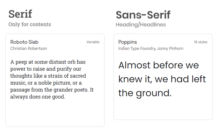
The stakeholders chose Poppins for the content. I like Poppins a lot but rejecting a Serif font is not a good sign when a website has readable content. But had to agree with them.
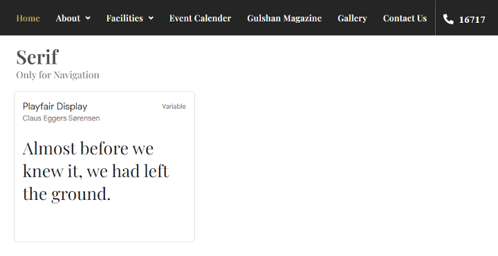
Ow! The font choice was not finished yet. They insisted to put Playfair Display on the navigation. Surprised? Well, don’t be. That’s the power of stakeholders and arguably the failure of a designer. So a lonely crow on a Poppins world is decided finally.
Wireframing Pen paper or tool?
Like most people, I’m not a big fan of pen and paper. Don’t just hate me. For me, paper can sometimes be a loss of information. Our lives are so digitally connected that most of us are more comfortable writing on the keyboard than on paper. A pen and paper is the best way to proofread a wireframe. I use low-effort wireframing tools to create wireframes, and then I draw flowers, circles, etc., in a printed copy. I find this method very effective. This is just my opinion. I am not looking to start a war.
Layout
Readers feel uncomfortable with full-width layouts. When a line of a sentence exceeds 60% of the screen, users lose interest in the content. They are more likely to skip it. Picture reading medium content at full width. Scary, huh?
Therefore, I proposed a layout that maintained the rule. Instead of putting headings at the top, I opted for the left.
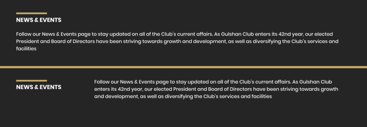
So they liked the idea and confirmed this layout. There were some other struggles I’ve been through but I don’t want to make this read a lengthy one. If you want to see the live website. The link is here